
Accessible Forms in React
For as long as I've been a front-end developer, I've never worked in a codebase where forms felt completely satisfactory. Despite a seeming low barrier to set up, they always seemed to attract usability challenges, inconsistencies across browsers, and many open questions such as:
- Should we validate on blur or on submit?
- Should we highlight required or optional fields?
- Should errors be rendered above or below form fields?
- Should we use live-regions or focus transfer for communicating/handling error states?
- Should we renders errors as a block summary above forms?
- Should hint text be injected into labels or left outside and associated via
aria-describedby? - What's the correct ARIA and focus management approach when validating a group of controls?
- How do we handle complex logic for dynamic forms, and keep users abreast of live UI changes?
Because forms are so widely used, I set out to build a solution that helps teams be more efficient and effective when creating accessible forms. I wanted something flexible—allowing developers to use any form controls they prefer while automatically handling correct ARIA attributes and labelling, and supporting the use of any validation schema library they choose.
My initial research pointed me to the excellent Form design patterns book by Adam Silver, which helped clarify several of the open questions I was facing. However, I couldn’t resolve everything on my own—many decisions required design input and a clear strategy for implementing changes. I chose to focus on a composable approach to maximize flexibility, allowing us to achieve significant accessibility improvements while keeping the solution adaptable for future evolution.
The following sections highlight some considerations to those open questions.
Abstract as much ARIA as is helpful
Form components should wrap any user-supplied form element and ensure correct ARIA attributes and proper labelling. Since most ARIA APIs require element ids, the solution would require a reliable way to generate ids automatically. For this I envisioned a Field wrapper component responsible for id/name and label accessibility.
Labels & Hint Text
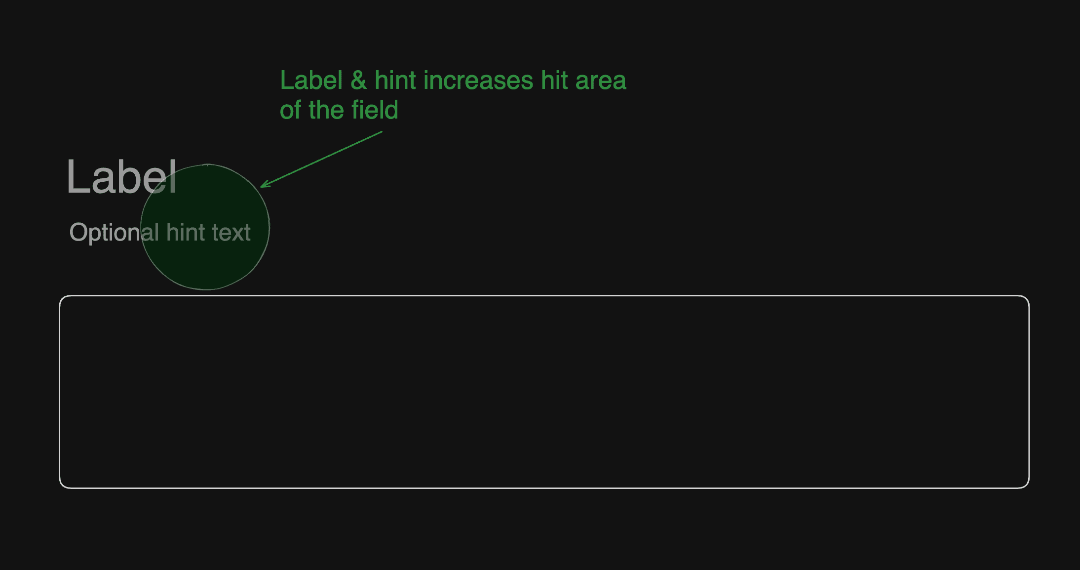
Form labels and hint text should be built as composable components. Since labels act as a proxy for their associated input—expanding the clickable area—using composition allows hint text to be injected directly into the label, making it part of that interactive area. Alternatively, a Description component could be used to place hint text outside the label, leveraging aria-describedby for proper accessibility linkage. I viewed the Description component as optional, useful in cases where design constraints prevent injecting hint text into the label itself.
Errors
Composition was a core requirement to ensure the solution remained adaptable as designs evolved. Placement of labels, hint text, and error messages needed to be flexible. There’s a case for displaying error messages above form fields, as placing them below can lead to issues with visibility—such as being hidden by autocomplete popovers or onscreen keyboards. If existing designs position errors below fields, switching to an above-field layout should be achievable through simple composition, without needing to modify core components. This flexibility also enables errors to be injected directly into labels when appropriate, reducing reliance on ARIA where possible.

Focus management
I consistently aimed to create an equivalent experience for all users. Providing live feedback using onblur would have required extensive use of live regions, which I wanted to avoid. The preferred approach was to validate on form submission (onsubmit), reducing the risk of disrupting users with premature or poorly timed feedback—such as when they switch windows or move to the next field before the message appears. However, for onsubmit validation to be effective, focus should automatically move to the first invalid field, ensuring users are guided directly to the issue without confusion.
Error Summary
The solution should also support the Error Summary pattern, where all form errors are displayed together in a block at the top of the form. This panel would use a role="group" and have a tabIndex="-1" to allow it to be programmatically focused without being part of the normal tab order. We intentionally avoid using tabIndex="0", as adding the error summary to the tab sequence could create a confusing tab stop that doesn’t offer meaningful interaction—potentially leading to a WCAG 2.4.3 failure. The summary would include a list of error links to help users quickly navigate to individual issues.

Since the Error Summary is revealed dynamically when the form enters an error state, we needed an effective way to transfer focus to that newly visible element. In React, the temptation might be a useEffect, but focus management is more of a transactional problem rather than a synchronisation one -- meaning focus should shift precisely when the user submits invalid data. For the solution, I created a small React hook which encapsulated a simple visible state with an onChange callback. This state could also be controlled from existing external state also. The key technique is initiating the state change inside flushSync, forcing React to flush updates inside this callback. This guarantees that the dynamically revealed element exists in the DOM at the moment we attempt to move focus to it.
const useFocusTransfer = ({visible: visibleProp,defaultVisible = false,onVisibleChange: onVisibleChangeHandler,} = {}) => {const [visible, setVisible] = useControlledState({State can be controlled or uncontrolledcontrolledValue: visibleProp,defaultValue: defaultVisible,})const focusTargetRef = React.useRef(null)const onVisibleChange = React.useCallback(() => {flushSync?.(() => {Update state inside flushSyncsetVisible((prevSwitched) => !prevSwitched)This is just a noop when using controlled modeonVisibleChangeHandler?.(!visible)})focusTargetRef.current?.focus()It's now safe to focus the target element}, [onVisibleChangeHandler, setVisible, visible])return React.useMemo(() => ({focusTargetRef,onVisibleChange,visible,}),[focusTargetRef, onVisibleChange, visible],)}
Form Groups
A group such as radiogroup contains multiple controls, and should be grouped by either a fieldset / legend or group / aria-labelledby construct. Here, validation is happening at the group level, so aria-invalid is placed on the grouping element rather than individual controls. At the time of writing, aria-invalid didn't seem to have wide support across browser / SR combinations on fieldset elements, but was supported on elements with role of radiogroup.

Moving focus to the first option in a group would be a bit more complicated than the basic use case of moving focus to the first input with an error, since in this case no radio option has an error. We need the grouping component to enable the focus transfer. However, each group control is a composed component, so it becomes more challenging for a component to "know" it is the first one in the group.
We could bail out of the composable model and instead internally map over the options in order to know the index of each option, but composition isn't something we'd want to compromise on. Using cloneElement may have been another option, but this inhibits composition also as a user can't then add wrapper elements.
A good solution instead would be a way for descendants to register themselves into context in such a way that they can retrieve their index position. I was aware of Reach UIs Descendants package, but I hadn't yet spent time to fully understand the full solution. I instead wanted to implement something simpler as a starting point before doing a deeper dive on other implementations in Reach UI, Radix UI, or Base UI. Here’s the basic approach I began with...
const getKeyFilter = (key: string) => {return (k: string) => k !== key;};type DescendantContextValue = {keys: string[];register: (key: string) => void;deregister: (key: string) => void;getIndex: (key: string) => number;};const DescendantContext = React.createContext<DescendantContextValue>({} as DescendantContextValue);const DescendantProvider = ({ children }: { children: React.ReactNode }) => {const [keys, setKeys] = React.useState<string[]>([]);const register = React.useCallback((key: string) => {setKeys((keys) => keys.filter(getKeyFilter(key)).concat(key));}, []);const deregister = React.useCallback((key: string) => {setKeys((keys) => keys.filter(getKeyFilter(key)));}, []);const getIndex = React.useCallback((key: string) => {return keys.indexOf(key);},[keys]);const contextValue = React.useMemo(() => ({keys,register,deregister,getIndex,}),[keys, register, deregister, getIndex]);return <DescendantContext.Provider value={contextValue}>{children}</DescendantContext.Provider>;};const useDescendants = () => {return React.useContext(DescendantContext);};export { DescendantProvider, useDescendants };
Required versus Optional fields
My solution didn’t prioritize one strategy over another. Adam Silver makes a compelling argument for highlighting optional fields. By adopting a questioning protocol—where each field's inclusion must be justified and all fields are considered required by default—it becomes more effective to mark optional fields instead. As a result, there's no need to add aria-required="true" to required fields.
Dynamic Forms
Our form solution would deliver fundamental accessibility features while offering enough inversion of control to support advanced scenarios—like dynamic forms where controls can be added or removed, as well as more complex branching logic.
Adding/Removing controls
Dynamically adding new form controls demands careful handling of live regions and focus management. For example, an asynchronous postcode search that reveals a listbox of results can use a live region to announce the number of matches found. In other scenarios, transferring focus might be more appropriate. It’s especially important to handle element removal thoughtfully—if the currently focused element is removed from the DOM, focus must be redirected to a suitable, logical element to maintain a smooth user experience.
Complex branching logic
A user should be able to handle complex logic in their preferred way. Whether it's handled with useState, useReducer, or a state machine should be in full control of the consumer. Where form has branching logic and can be modelled via finite states, then a state machine to orchestrate that logic can massively reduce complexity in the UI layer.
Final Solution.
The final solution was initially based off the ShadCN Form component. The basic Form anatomy provided by ShadCN gave me a great base to build from. Wrapping around react-hook-form and giving basic form ARIA and labelling proved very simple. This basic form anatomy was:
<Form><FormField><FormItem><FormLabel /><FormControl /><FormDescription /><FormMessage /></FormItem></FormField></Form>
Building out the Error Summary pattern and form grouping required some extra components to handle focus management. The grouping API was:
<Form>{/* This FormField represents the group */}<FormField><FormItem>{/* Creates the group container with role of group */}<FormGroup>{/* Wires up an auto-generated id with the group element'saria-labelledby attribute */}<FormGroupLabel>{/* Your group label */}</FormGroupLabel>{/* FormDescendantProvider is necessary so that eachgrouped control can participate in focus management */}<FormDescendantProvider>{/* for each field */}<FormField><FormItem>{/* Each control is wrapped in a FormControlGroup toenable focus management. Must be rendered insideFormDescendantProvider */}<FormControlGroup>{/* Your control */}</FormControlGroup><FormLabel>{/* Your control label */}</FormLabel></FormItem></FormField></FormDescendantProvider></FormGroup><FormMessage>{/* Your group level error message */}</FormMessage></FormItem></FormField></Form>
This gives an idea of the low-level APIs intended to work with any form control. Since we already owned a set of existing controls, we were able to create higher-level APIs to integrate with the existing control APIs, allow further abstraction of some
of the wiring to react-hook-form. However, users can easily drop to composable APIs when working with any new form controls.
So far the solution is working very well. I intend to keep an eye on other implementations such as Tanstack Form.